Brisbane Keg Servicing
Project Overview
The Brief
Brisbane Keg Servicing was a newly established business offering repairs and servicing for steel beer kegs.
The owners came to me with their business name, a few logo examples they liked and a straightforward brief. They wanted the design to include a keg, a tap and some of the mechanical character of the work they do.
The logo also needed to be practical. It would be used on keg stickers, signage, work shirts and promotional materials, so it needed to remain clear and recognisable at different sizes.
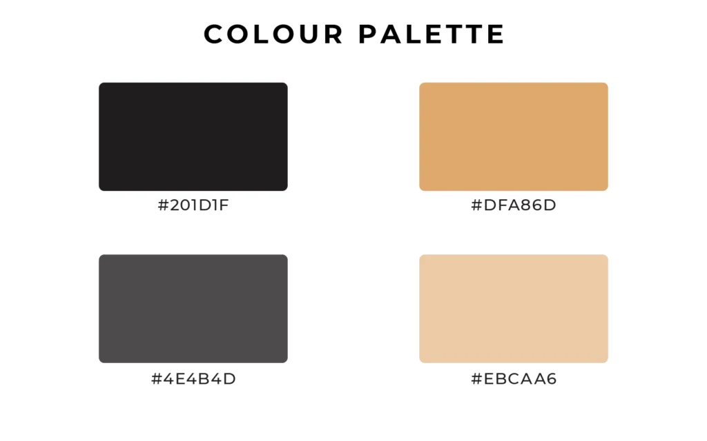
They preferred earthy colours rather than anything overly bright, so I developed a warm palette of black, cream and tan. It gave the identity an industrial feel while moving away from the black-and-red colour combinations often seen in the industry.
Developing the Logo
The first concept explored adding keg-inspired detailing to both Bs in BRISBANE. The idea tied the lettering back to the business, but the client felt the horizontal bands made the Bs look too much like equals signs.
I simplified the lettering and let the keg icon carry that idea instead. This kept the business name easy to read and gave the icon more room to stand on its own.
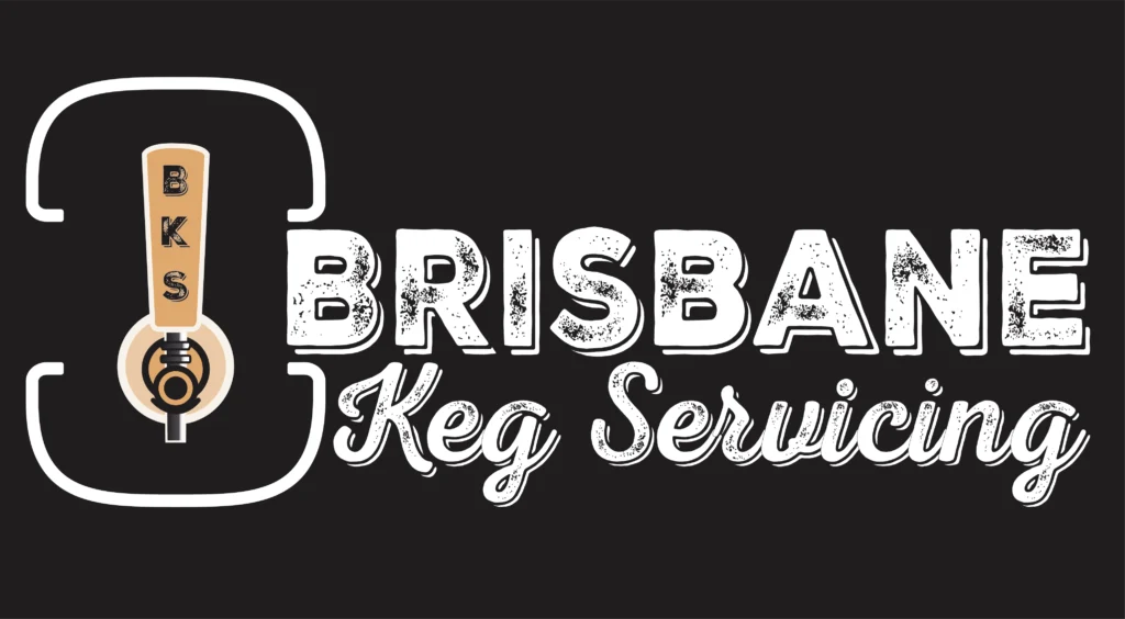
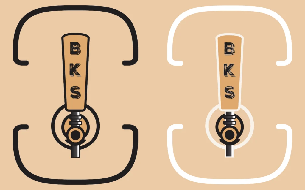
The final icon uses a simple keg outline with the tap running through the centre. The BKS initials were added to the tap handle, creating a secondary mark that could also work on keg stickers and other smaller applications.
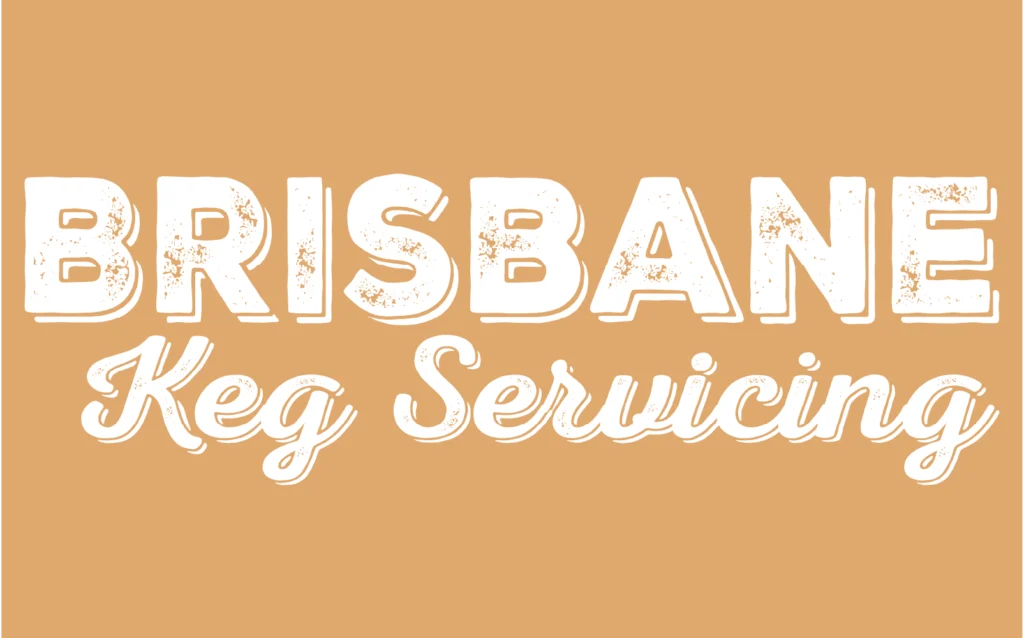
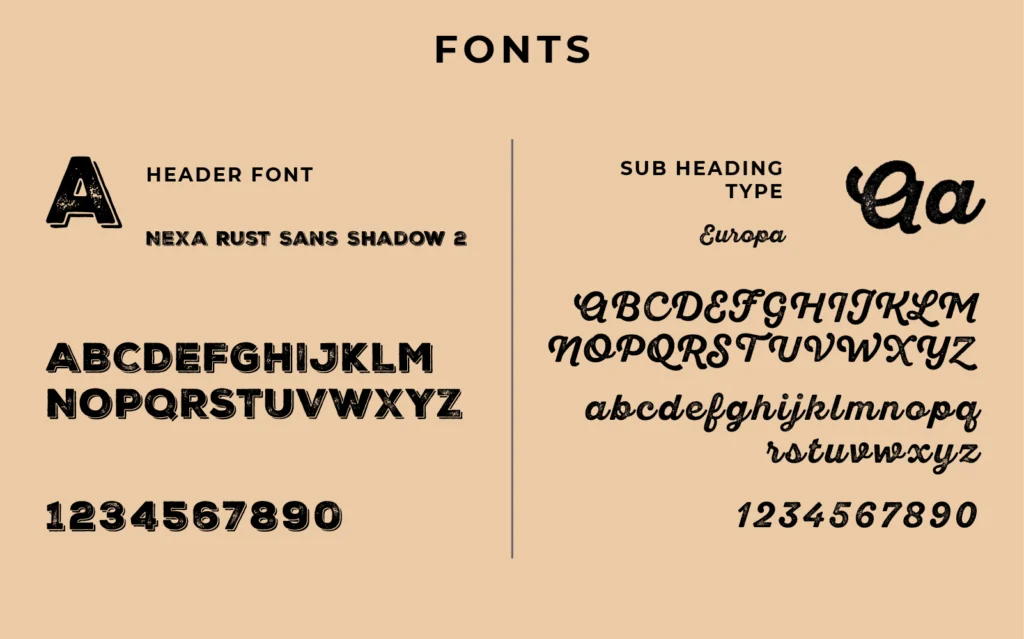
Several type styles and layouts were tested before settling on a bold, distressed uppercase font for BRISBANE, paired with a softer script for Keg Servicing. The contrast keeps the industrial feel without making the whole logo too heavy.
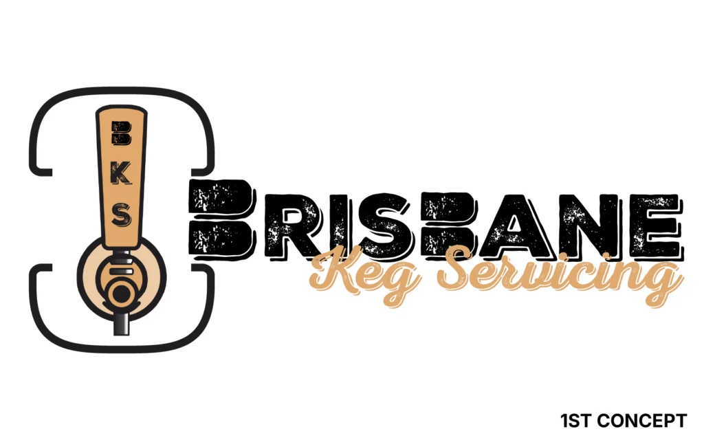
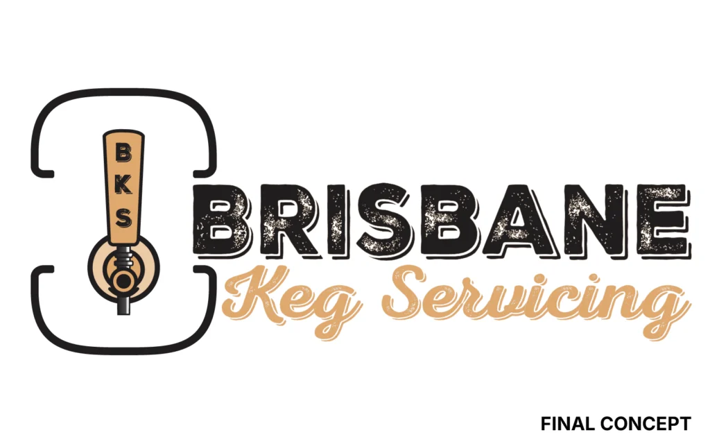
First concept, left: keg-inspired detailing in the B letterforms. Final concept, right: the Bs were simplified and the keg remained as a standalone icon.
Project Inclusions
Custom keg and tap logo mark
Primary logo lock-up
Earthy colour palette
Typography selection
Typography selection
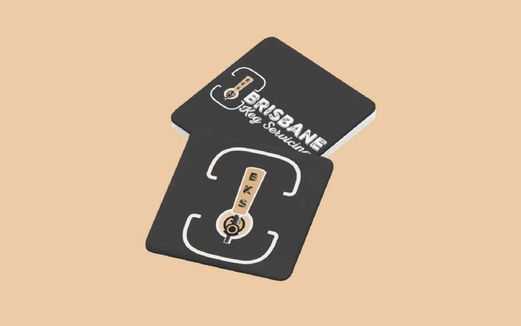
Light and dark logo versions
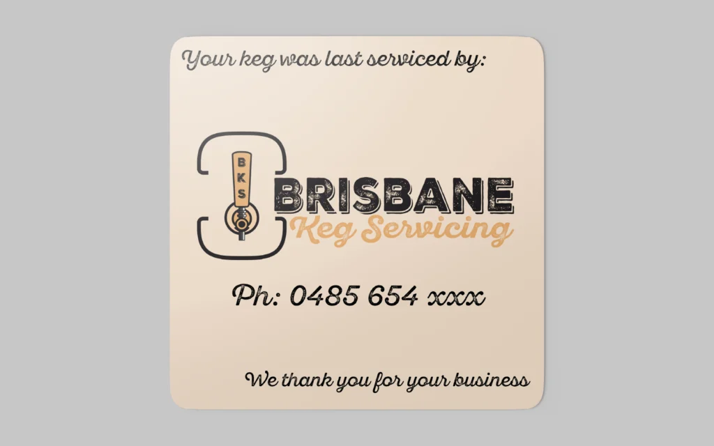
Keg service sticker design
High-resolution files for print and digital use
Final Identity
The finished logo is practical, recognisable and suited to the keg servicing industry.
The keg and tap make the type of business immediately clear, while the BKS initials worked into the tap handle give the mark a detail that belongs specifically to the business. The different logo versions also make it easy to use across small keg stickers, signage, work shirts and other business materials.
The final identity gave the new business a flexible set of logo assets it could start using straight away.
Gallery
Ready to Build your brand?
Logo, brand identity and print-ready artwork. Based on Bribie Island, working across South East Queensland or online.