Coastal Sheet Metal Installations
Project Overview
The Brief
I first designed the CSMI logo in 2011. It was one of the first logos I created, before I began studying graphic design at university.
The initials were built from pieces of metal ducting, complete with joint details and a metallic finish, and placed over an outline of Australia. That logo went on to represent the business for fifteen years across business cards, work shirts and other company materials.
By 2026, both the business and my approach to design had changed a lot. The gradients, shadows and detailed metal effects were showing their age, but more importantly, they made the logo difficult to reproduce cleanly in embroidery, vinyl and smaller print.
The new identity needed to keep a connection to the original while being much cleaner, easier to reproduce and practical across everything from a shirt pocket to large signage.
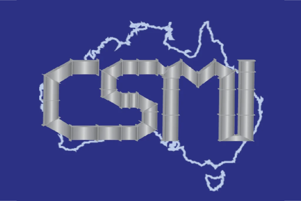

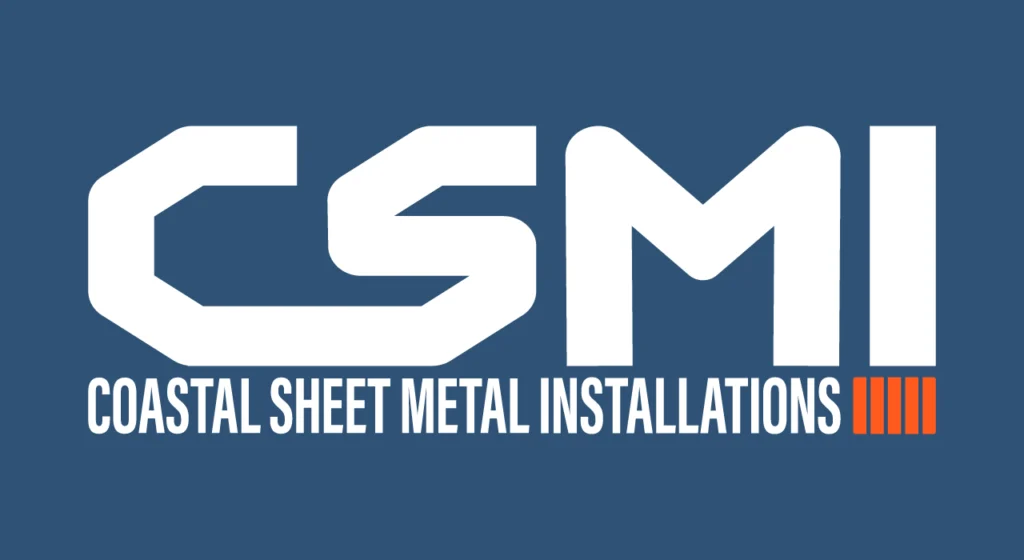
Original CSMI logo, 2011. Updated identity, 2026.
Developing the Logo
I first looked at modernising the original ducting letters. The idea still suited the business, but keeping the rendered pipework brought back many of the same problems as the old logo.
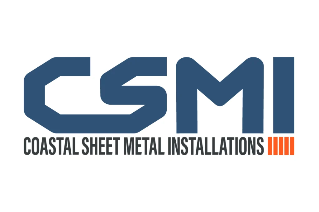
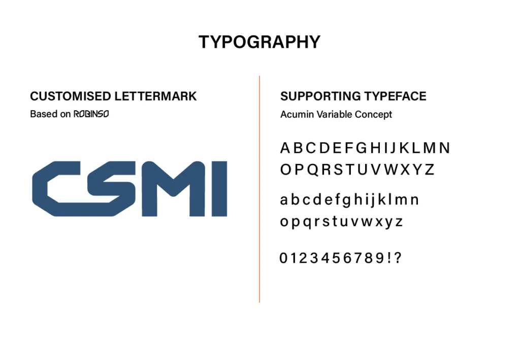
I used ROBINSO as the starting point for the CSMI initials, then reshaped and connected the letterforms to create the feel of folded sheet metal. Solid shapes, angled cuts and rounded corners keep some of the industrial character of the original without relying on the old three-dimensional effects.
The simpler construction means the logo stays clear at smaller sizes and reproduces properly across embroidery, print, signage and vinyl.
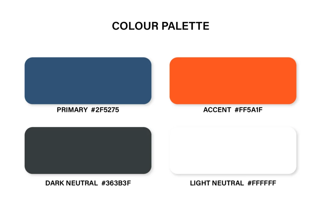
Blue and orange were chosen to tie the identity back to the safety workwear already used by the business. The deeper blue reflects the main shirt colour, while the bright orange picks up the high-visibility panels and the safety colours commonly seen on site.
The orange is used as an accent rather than the main colour, helping details stand out without overpowering the logo.
The louvre detail gives a subtle reference to air conditioning and ventilation and adds an industry-specific detail to the lettermark.
The full business name is set in Acumin Variable Concept. Its condensed shape allows the longer name to sit neatly beneath the CSMI lettermark while staying clear and readable.
Project Inclusions
Customised CSMI lettermark
Primary logo lock-up
Full-colour and single-colour versions
Light and dark logo versions
Navy, orange and neutral colour palette
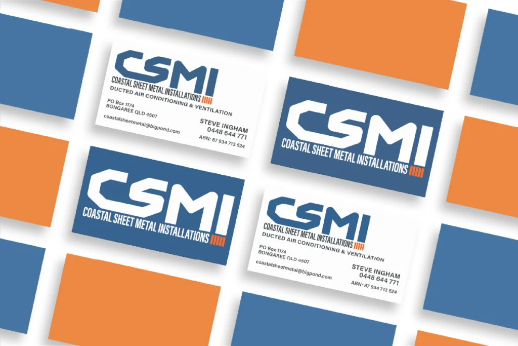
Business card design
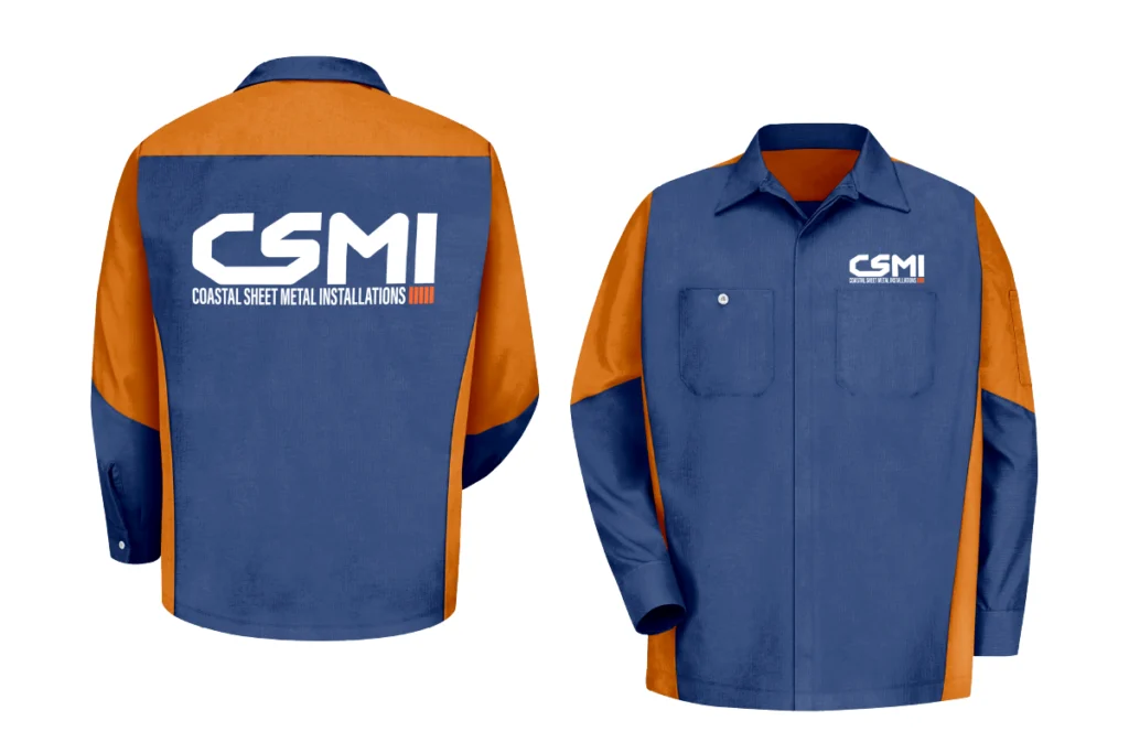
Work shirt artwork
High-resolution files for print and digital use
Final Identity
The new identity keeps the recognisable CSMI initials, but is much cleaner and easier to use across the business.
It works at small sizes, can be reproduced in a single colour and stays clear across embroidery, business cards, signage, workwear and vinyl.
Fifteen years after the original was created, CSMI now has an identity that still connects back to where it started, but works much better for the business it is today.
Gallery
Ready to Build your brand?
Logo, brand identity and print-ready artwork. Based on Bribie Island, working across South East Queensland or online.