Scott Caboolture Mechanic
Project Overview
The Brief
The original logo was created in 2022, when the client had just left his job to start a mobile auto repair and servicing business called Scott’s Customs.
He liked dark backgrounds, metallic blue and silver finishes and bold automotive lettering. The brief was fairly open, but I wanted to avoid the usual mechanic logos built around spanners, pistons and car silhouettes.
The logo needed to feel clearly automotive while giving the new business an identity of its own.
Developing the Logo
Using the client’s reference images as a starting point, I explored three different directions before developing the final concept.
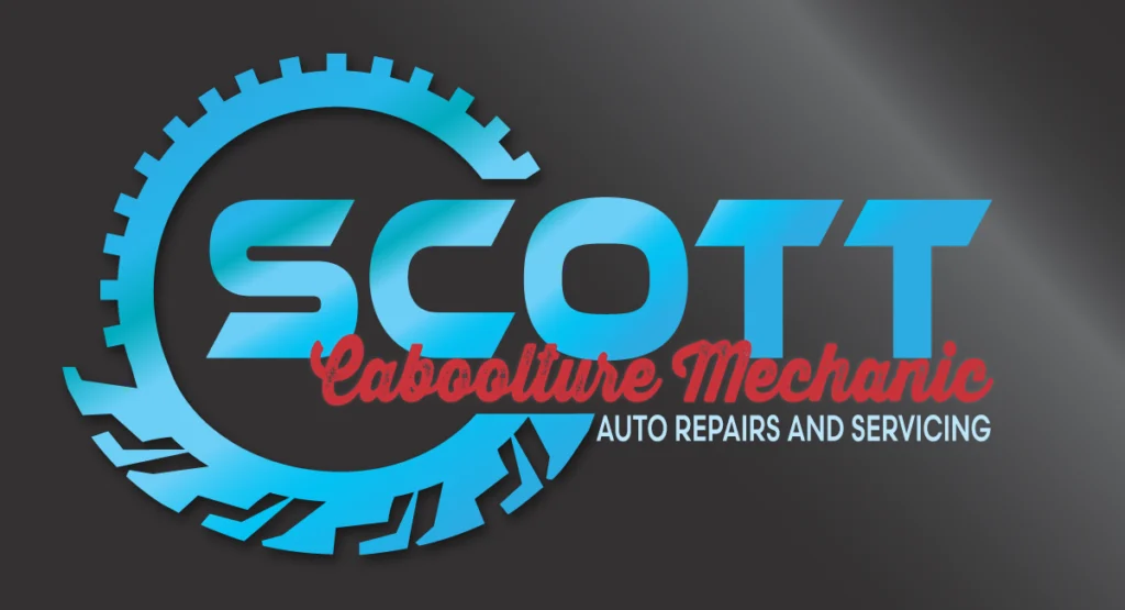
The chosen design combines a gear and tyre into one custom circular mark. Gear teeth form the upper section, while tyre tread cuts through the bottom, creating a clear connection to automotive work without relying on a collection of familiar mechanic symbols.
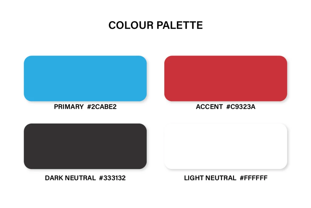
The client chose this direction straight away. The main layout stayed largely unchanged, with the biggest revision being the accent colour. The original orange was replaced with a deeper red to create stronger contrast against the metallic blue and silver.
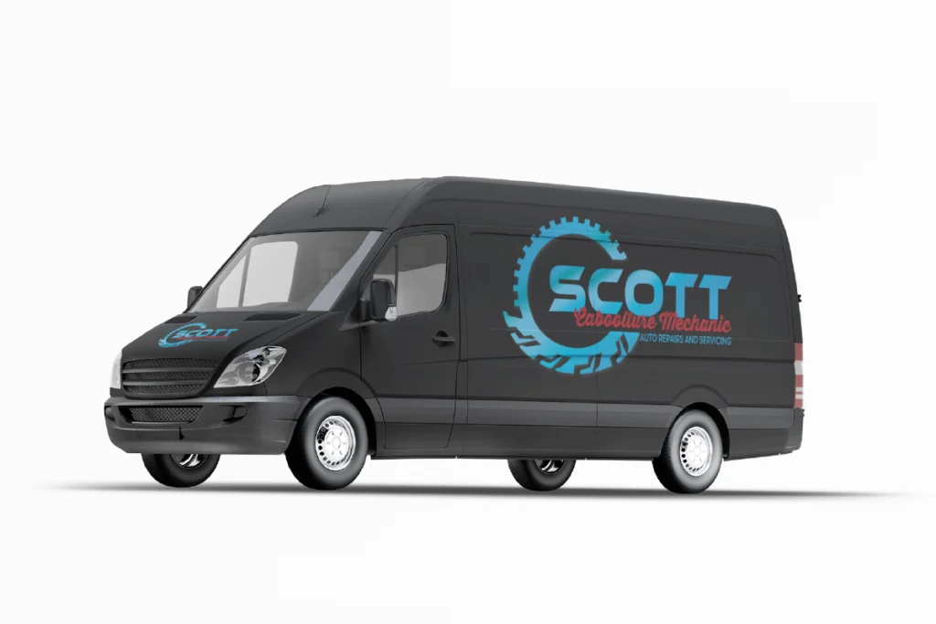
From there, I refined the gradients, depth and spacing and prepared the identity for use across vehicle signage, work shirts, stickers, business cards and other business materials.
The 2026 Update
By 2026, the business had moved from mobile servicing into a workshop and changed its name from Scott’s Customs to Scott Caboolture Mechanic.
The gear-and-tyre mark was still working well and had become recognisable, so there was no reason to replace it. The update was mainly about adapting the existing identity to the new name and the way the business now operated.
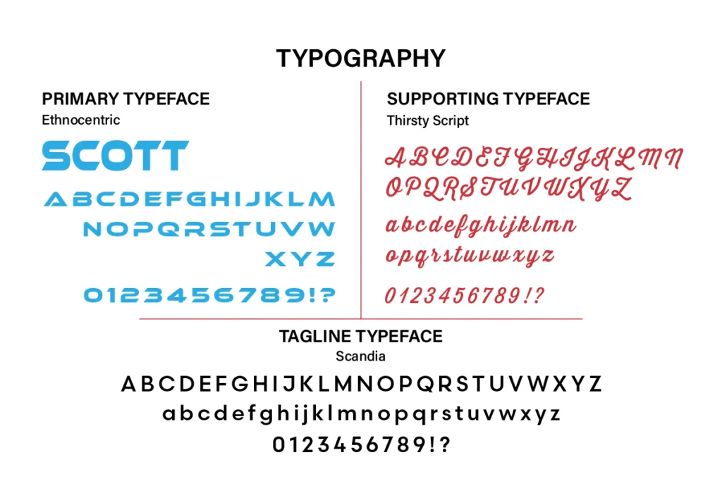
Ethnocentric was retained for SCOTT, with Thirsty Script used for Caboolture Mechanic and Scandia for the supporting tagline.
I also created flat light and dark versions for embroidery, vinyl, signage and smaller applications where the metallic gradients are not practical.
Original logo, 2022. Updated identity, 2026.
Project Inclusions
Customised gear-and-tyre mark
Primary logo lock-up
Full-colour metallic logo
Flat light and dark versions
High-resolution files for print and digital use
Vector artwork for signage and scaling
Final Identity
The original identity has carried with the business from its mobile beginnings into a permanent workshop, with the 2026 update allowing the name to change without losing the gear-and-tyre mark people already recognised.
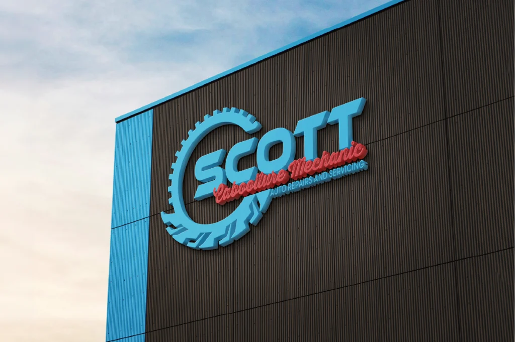
The different logo versions make it practical across vehicles, workshop signage, workwear, embroidery, print and digital use.
"It's so different to everything else out there. I can't tell you how many comments we are getting about how cool the logo is."
Scott Caboolture Mechanic
Gallery
Ready to Build your brand?
Logo, brand identity and print-ready artwork. Based on Bribie Island, working across South East Queensland or online.